
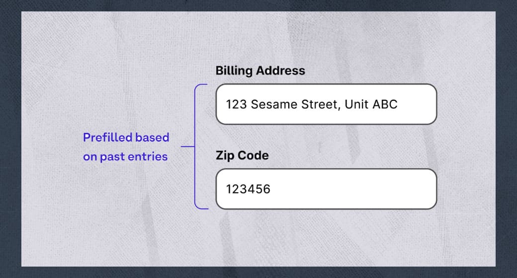
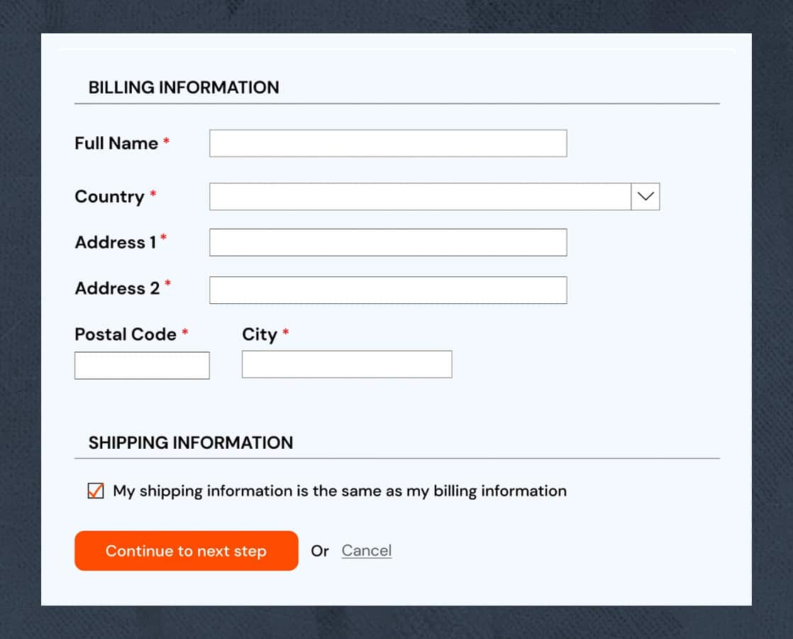
SC 3.3.7 Redundant Entry (Level A) [2]
In relation to web forms, less redundancy means more efficiency. By minimizing repeated inputs, the intention is to reduce complexity, especially for users with disabilities.
The purpose of this success criterion is to reduce cognitive load and effort when completing forms for users with cognitive, memory, and mobility problems.
How to pass this criterion?
Ensure the information previously entered is autocompleted or available for the user to select.
This behavior is required only during the session. There is no need to remember old session data to pass it.
It’s important to know that browser autocomplete is insufficient to pass, because this criterion requires the website content itself to provide the stored information.
What should we do to pass?
Provide a mechanism to select previously entered data.
Examples:
Prefill form information:
Add a checkbox that lets the user prefill previous data:
Provide a way for the user to copy and paste the information, or a dropdown to re-select previously entered information:

Exceptions to this rule:
When is it essential that the user re-enter the information? For example:
- When entering a new password twice to verify that they are the same.
- When re-entering the information is essential (like in memory games).
- When previous information is no longer valid.
WCAG 2.2: Level AA
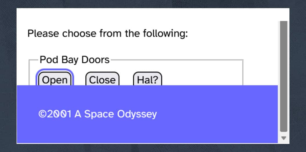
SC 2.4.11 Focus Not Obscured (Minimum) (Level AA) [3]
Focus not obscured is a criterion to support keyboard users and users with cognitive or memory impairments.
Its purpose is to ensure that any component receiving focus is not entirely hidden due to author-created content.
Tips to Understand This Criterion
The key phrase is “not entirely hidden”. You meet the criterion when the focusable element is visible, even if slightly overlapped by author-created content.
Considerations for this criterion include:
- Where content in a configurable interface can be repositioned by the user, only the initial positions of user-movable content are considered for testing.
- Content opened by the user may obscure the component receiving focus. If the user can reveal the focused component without advancing the keyboard focus, it is not considered visually hidden due to author-created content.
Problem This Criterion Solves
Knowing the current focus position is crucial when users cannot see focused items. Without this knowledge, users may become lost and unable to proceed.
Examples of Failures
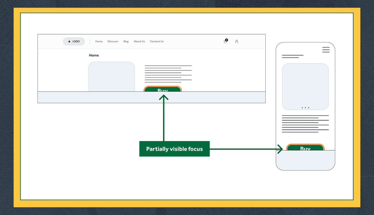
A sticky header positioned over interactive elements like a navigation bar, completely hiding the active element when tabbing.
A sticky footer obscuring elements at the bottom of the page.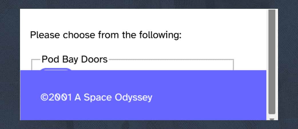
Other floating elements, such as cookie banners, hiding interactive elements.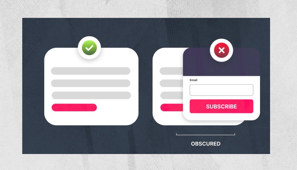
How to Pass This Criterion
Ensure that the focus position is always easy to identify.
Avoid floating content, such as sticky headers or footers, that could hide interactive elements.
Important Considerations
- Content displayed above focusable elements is permitted if it does not persist once an interaction has occurred. For example, if the user moves content by dragging a component, obscuring a focused element, the success criterion is not failed because the user modified the state.
- The criterion fails only if the initial position obscures existing focusable elements and popup behaviors are not implemented properly.
- The criterion does not fail if the user opens a component, such as an expanded menu, and the control focus is obscured temporarily, as long as the user can close the menu (e.g., with the Escape key).
- Modal dialogs pass this criterion if properly coded according to ARIA guidelines and keyboard interaction is constrained.
SC 2.5.7 Dragging Movements (Level AA) [6]
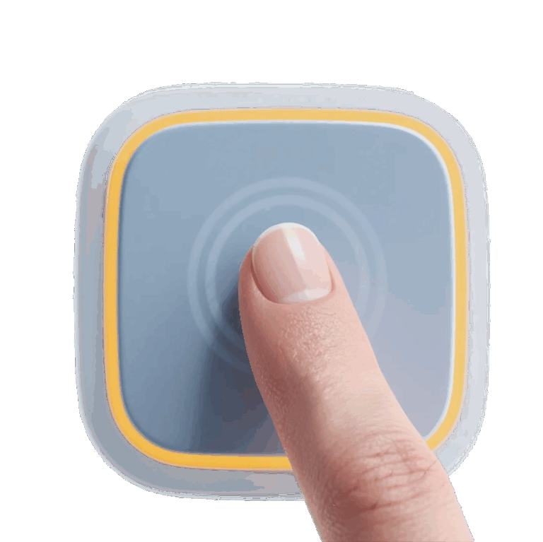
Consider how the action of drag and drop can be challenging for certain users. This criterion aims to help users with reduced fine motor control or those who use a trackball, head wand, or speech-controlled mouse emulators.
In a drag and drop action, you select an element and place it where you want without worrying about the path you take. You simply move the item from one section to another.
How to Pass This Criterion
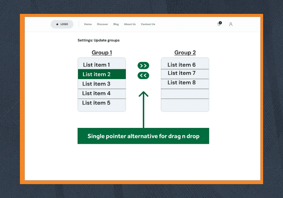
To pass this criterion, ensure that the dragging functionality can be activated by a single pointer without dragging. This means providing an equivalent interaction for users who cannot perform drag and drop actions with precision.
You might be tempted to think that simply adding a button alternative is enough:
Unfortunately, this is not enough because users with touchscreen devices might not use a physical keyboard. Being keyboard accessible is not enough – it is the motion of dragging which requires an alternative.
This success criterion specifically covers pointer interactions, where the action happens via dragging and an equivalent option must exist that allows a single pointer interaction without dragging.
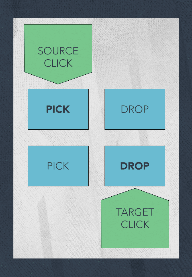
Point A to Point B
A technique that passes this criterion is to allow the user to select point A with a click and then click at point B.
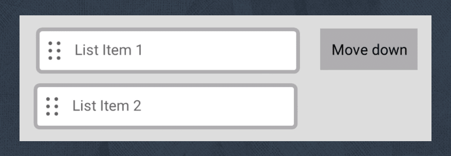
Single Pointer Alternative to Drag and Drop
Be careful with this technique. The following example will fail this criterion:
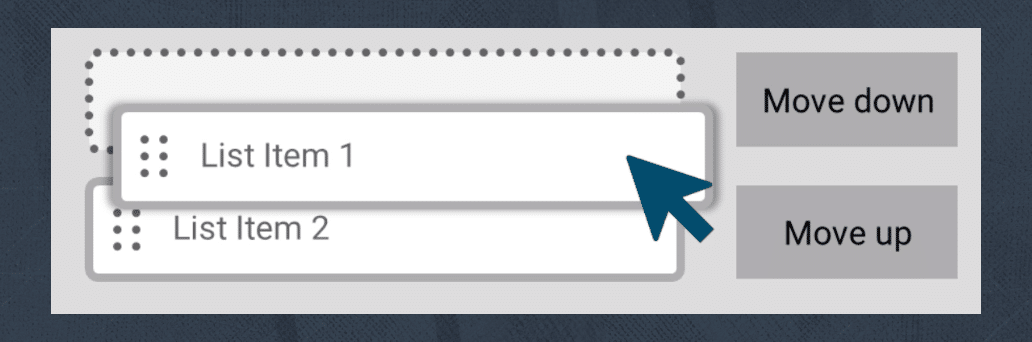
Why does it fail?
It fails because there is no alternative to reorder the list via a single pointer input. In this scenario, the user would need to move down or up several times to move the first item to the last position.
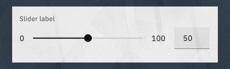
Sliders
Another drag-and-drop action that is very common is the use of sliders. A technique to make it accessible is to provide an input to directly indicate the value of the slider.
It’s important to clarify that drag and drop can still be used as part of your implementations, but it is necessary to provide alternatives as described above.
SC 2.5.8 Target Size (Minimum) (Level AA) [14]
This criterion might sound familiar, as it exists in WCAG 2.1.
Within WCAG 2.1, there is a success criterion
2.5.5 Target size (AAA) [13],
which indicates that the target size must be at least 44px × 44px. For WCAG 2.2, this criterion has been renamed to
2.5.5 Target Size (Enhanced) [8]
after the addition of the new criterion 2.5.8 Target Size Minimum for level AA, because WCAG 2.1 has no clear definition of the required target size for this level of conformance.
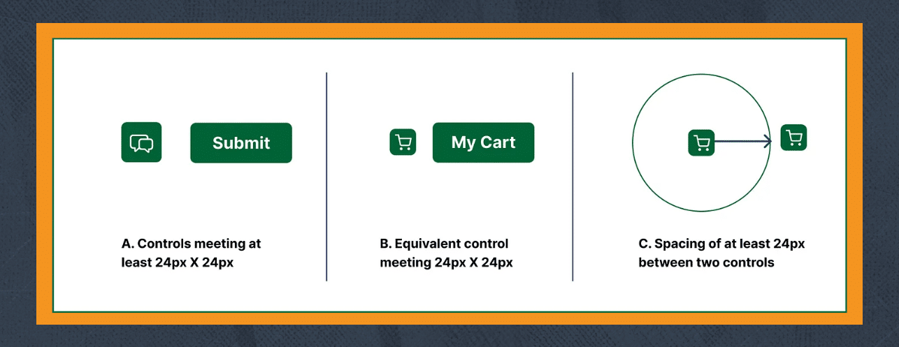
The new success criterion requires a minimum target size of 24px × 24px to help users with reduced or imprecise mobility. Users with dexterity limitations or specialized devices may find it difficult to activate small targets or when targets are too close together.
Exceptions to This Rule
- Inline links within a paragraph where the font size cannot be 24px.
- Elements with insufficient size but with white space around them of 24px × 24px that does not overlap another target.
- When another control exists that meets the 24px × 24px requirement and performs the same action.
- When the size less than 24px × 24px is essential, such as map pins requiring accuracy.
- When the size of the target is controlled by the browser and not the author.
How to Pass This Criterion
- Target elements are at least 24px × 24px.
- Undersized target elements have enough gap (24px × 24px minimum) between them and adjacent targets.
- Links within paragraphs.
- Keep checkboxes native (unstyled), since the browser defines their size. If styled, ensure a minimum of 24px × 24px.
SC 3.3.8 Accessible Authentication (Minimum) (Level AA) [9]
Accessible authentication (Minimum) supports users with cognitive impairments including memory, reading, numeracy, or processing of images and objects.
This criterion specifically requires that a cognitive function test is not required at any step of the authentication process.
The goal is to reduce cognitive load while providing an easy and secure authentication method.
According to the W3C, a cognitive function test is a task requiring the user to remember, manipulate, or transcribe information.
Examples of Cognitive Function Tests
- Memorization of a username, password, set of characters, images, or patterns.
- Important Note: Email, name, or phone number are not considered cognitive function tests, as they are personal and consistent across websites.
- Transcription, such as typing characters from a 2FA code.
- Solving puzzles.
- Using correct spelling.
- Performing calculations.
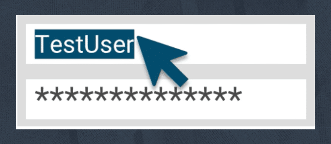
People with cognitive issues may find it difficult to remember passwords, solve puzzles, or complete mathematical equations. Alternatives include recognizing a picture, using a password manager, or copy/pasting a password.
If authentication requires 2FA or CAPTCHA, it may be nearly impossible for some users to log in without an alternative method.
How to Pass This Criterion
Providing additional support during authentication is sufficient to pass. This could include:
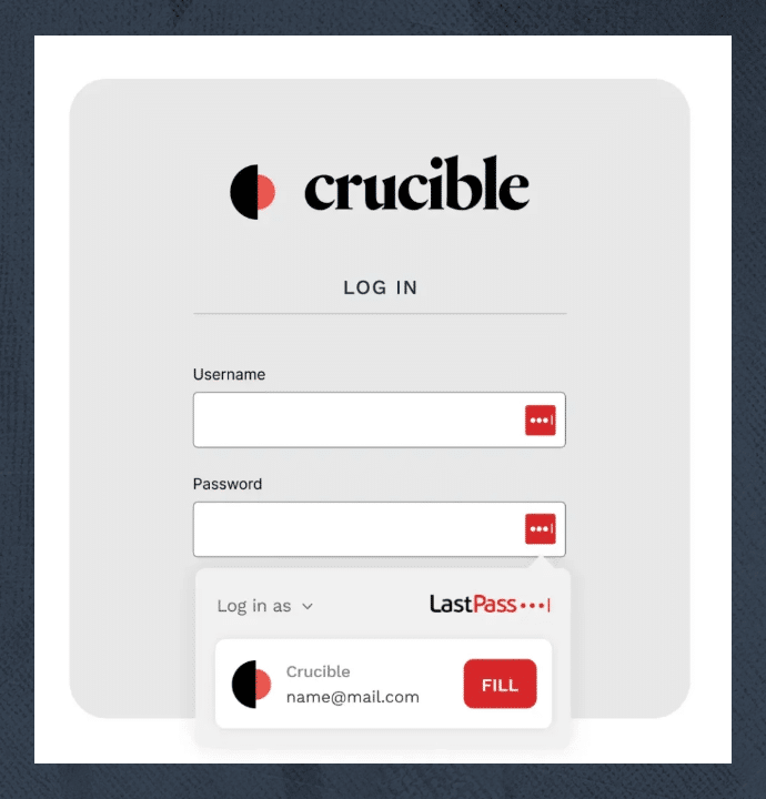
- Adding autocomplete attributes on input fields.
- Relying on a password manager to remember credentials.
- Allowing copy and paste functionality to reduce cognitive load.
- Ensuring alternative authentication methods exist if CAPTCHAs are required.
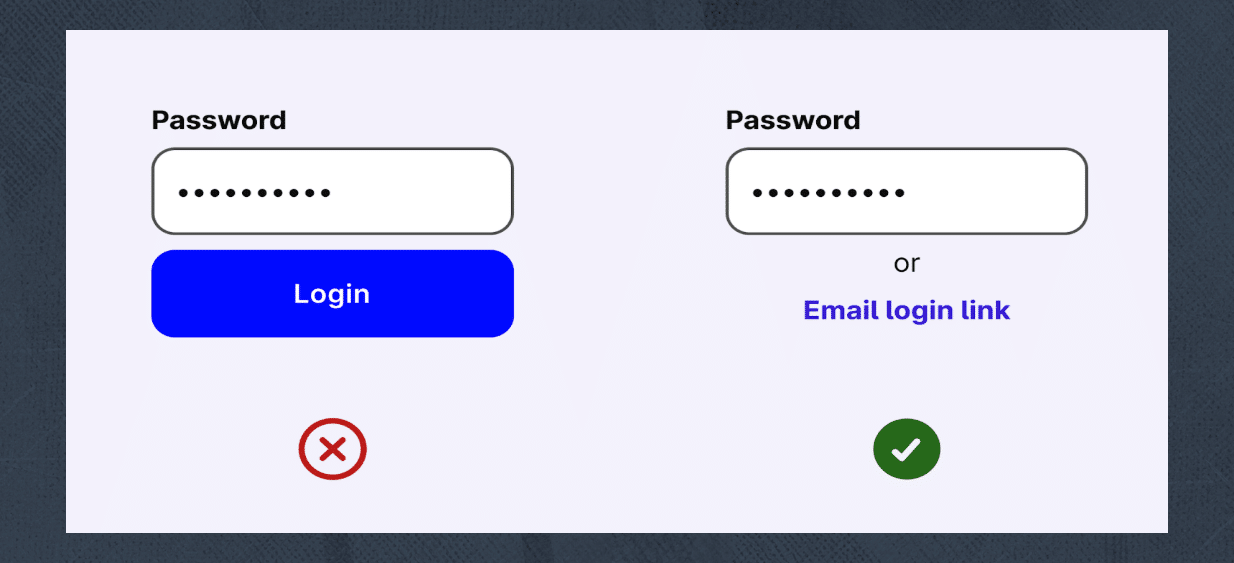
Examples That Pass
- User is authenticated via email without needing to transcribe a code.

- Forms with autocomplete attributes properly set, allowing the browser or password managers to remember values.
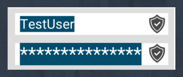
- Forms that allow copy and paste.
Examples That Fail
- Website requiring 2FA with code sent to a separate device, forcing the user to remember and transcribe it.
- Website requiring CAPTCHA as part of authentication without providing an alternative login method.
WCAG 2.2: Level AAA
SC 2.4.12 Focus Not Obscured (Enhanced) (Level AAA) [5]
Even though this criterion follows the same ideas detailed in SC 2.4.11, the difference lies in the fact that SC 2.4.12 is more restrictive.
How to Pass This Criterion
In this criterion you have to ensure that you do not cover any part of an interactive element at all.
In the following example, you will pass SC 2.4.11 but not SC 2.4.12:
SC 2.4.13 Focus appearance (Level AAA)[7]
Having a focus indicator more prominent is crucial for users to see where they are in the page.
A prominent focus indicator basically means that when you navigate and use an element using the keyboard, there should be a visible indicator showing where your focus is.
This criterion intends to support users with low vision and with cognitive and memory impairments by ensuring the focus indicator is easy to identify.
In this criterion the requirement is that when visible the focus indicator is at least 2px thick perimeter of the unfocused component and it has a contrast ratio of at least 3:1 between the same pixels in the focus and unfocus states.
We need to ensure that the focus is always easy to see and the contrast between when it is focused or not has an appropriate contrast. Also we need to be sure that the size of the focus indicator is big enough to be useful.
How to pass this criterion?
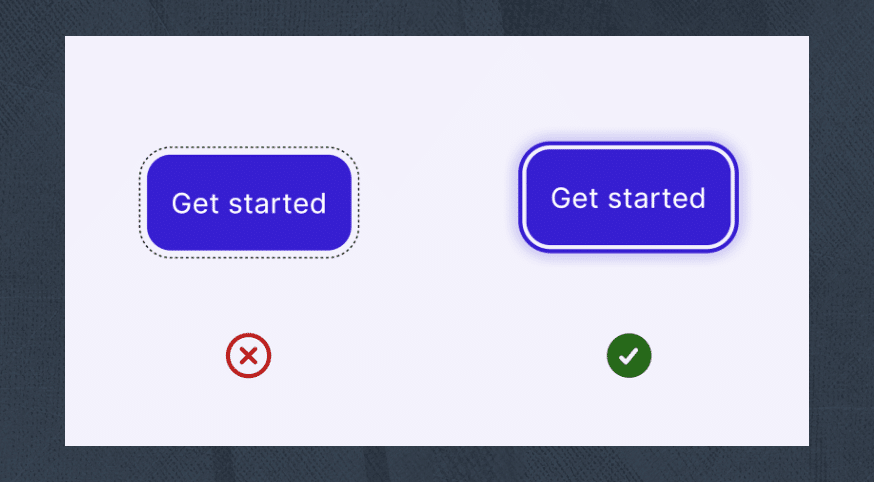
The left option fails the SC 2.4.13 since it too lightly highlights the focus element. The right one uses a bolder, clearer highlight that meets SC 2.4.13 Focus appearance.
- Use a solid 2px (minimum) outline around the component.
- Ensure the color of the outline when focus and unfocus has a contrast ratio of 3:1.
Exceptions to this rule
- When the focus indicator is determined by the browser and can not be modified by the author.
- When the focus indicator or background color are not modified by the author.