Writing for
Good
Insights

In Brief
This article focuses on the accessibility rules related to users with vision impairment, users who need to magnify screens, who are color blind, who need a high contrast color to be able to read, or users who have a good vision but have reading disabilities or cognitive issues that make things difficult to understand, distinguish or affect pain receptors.
Statistically there are nearly three times more people with low vision than total blindness and one person in twelve have some color deficiency.
Accessibility in digital contexts
When it comes to web accessibility, understanding the terms MUST, SHOULD, and MAY is crucial. These terms are used in the Web Content Accessibility Guidelines (WCAG) 2.1 Level AA to define the different levels of conformance required for websites to be accessible to people with disabilities.
MUST, SHOULD, and MAY in all capital letters, is in reference to conformance with accessibility standards set by WCAG 2.1 Level AA as follows:
- MUST: Required
- SHOULD: Strongly recommended
- MAY: Optional or conditionally recommended

About colors
Any information conveyed by color MUST be accompanied by a programmatically determinable text alternative.
Screen readers don’t read colors. If color is the only way to transmit information, users with impaired vision or blindness would not be able to understand it.
The text alternative for information conveyed by color MUST accurately convey the same information without color.
The alternative text accompanying the color must inform the user of exactly the same thing that the color does, with all the pertinent details.
Any information conveyed by color MUST be accompanied by a visible alternative (text, image, etc.) that does not depend on color for meaning.
This is an important accessibility feature for users who are colorblind or who have low-contrast vision. Some colors look similar, so it is critical not to just use color to present information.
For example, a color-blind user would have difficulty understanding an error where the message is presented just with the color red. Colors can be used, but they must always be presented with a legend or text that gives meaning to the color or message.
In the case of an error message, you can use red but with an explicit message that indicates textually that it is an error, for example, “Error: URL cannot be found.”
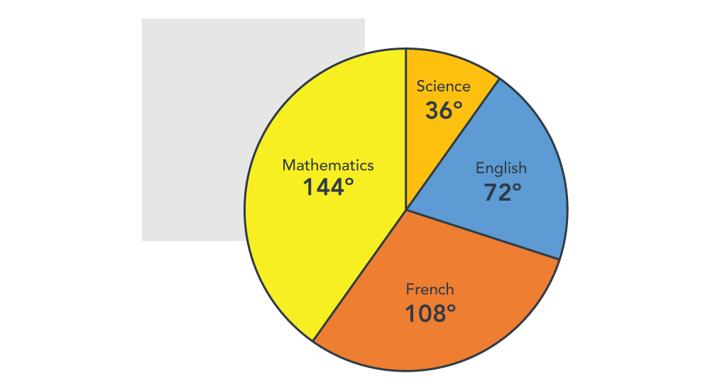
Another good example is the following color-based chart with additional text labels.
Color alone MUST NOT be used to distinguish links from surrounding text unless the color contrast between the link and the surrounding text is at least 3:1, and an additional differentiation is provided when the link is hovered or receives focus.
Users must understand the difference between regular text and a link; if not, they are more likely to miss important links.
Best practice techniques to achieve that are: different colors and underlining, different colors and underlining just when on hover or focus, the different background colors on hover or focus, adding an outline or border on focus and hover, or placing it in a menu. Sighted users will understand that the items inside a menu are links.
Color SHOULD NOT be used as the sole method of distinguishing UI components and/or their surrounding content, unless the color contrast between the UI components and/or surrounding content is at least 3:1.
If we use icons as buttons and icons as part of the text, if the color contrast is not high enough, users with low vision will have difficulty understanding which icons are buttons. It would be better to add a background or border to the icons that work as buttons.
Visible text SHOULD be standard text in the markup (not images or graphic versions of text) to allow user customization of text color and contrast.
Even when accessibility guidelines require a minimum contrast between the text and the background, some users are sensitive to colors and need to change them using other assistive technology (such as Windows High Contrast Mode). To do that, the website needs to use real text instead of images.
Visible UI components SHOULD use native controls and features (not images or graphic versions of controls) where available to allow user customization of interface color and contrast.
I hope no one is using this technique nowadays, but the same as the last rule: do not use images as controls, such as buttons. Software that allows you to customize colors cannot customize the color of the images.
Color Contrast
Small text MUST have a contrast ratio of at least 4.5 to 1 with the background.
A background can be a solid color, an image, or a video, and it’s considered small text if it is under 18-point regular font or 14-point bold font, in pixels 24px or 19px.
If the contrast between the text and the background is 4.5:1, users with low vision may not need contrast-enhancing assistive technologies. This rule also helps people with color deficiency, where the color may affect how they perceive the content.
Small text SHOULD have a contrast ratio of at least 7 to 1 with the background.
This rule applies to mobile applications. Due to the small viewport size, best practice is to increase the contrast for small text (under 18-point regular font or 14-point bold font) beyond the minimum, which will make the application more accessible.
Large text and images of large text MUST have a contrast ratio of at least 3 to 1 with the background.
Large text that is 18-point or 14-point bold has wider strokes, which makes it easier to read at a lower contrast. So, the contrast rule for large text is lower.
Any visual boundary that indicates an active user component’s hit area MUST have sufficient contrast of at least 3 to 1 with the adjacent background.
It’s important to know that a visual boundary that indicates the hit area in every component isn’t always necessary, but if a visual indicator is the only way to identify a component, it must have sufficient color contrast.
Best practice is to ensure that low-vision users can perceive parts of the screen that are not necessarily text but are still crucial for using and understanding content. These elements include buttons, form elements, links, and user controls. Without sufficient contrast on buttons and other controls, users may be unable to distinguish them from the background.
The exception to this rule is when the component’s appearance depends on the user agent.
The visual state of an active user interface component MUST have sufficient contrast of at least 3 to 1 with the adjacent background.
The visual states of user components are focus, selected, unselected, hover, and others. Exceptions to this rule are the disabled state and when the user agent determines the color.
Parts of graphics MUST have a contrast ratio of at least 3 to 1 against adjacent color(s).
Graphics that convey information must also meet this non-text minimum contrast ratio. This includes icons that convey information, lines in line graphs, and slices in pie charts. An exception to this rule is when changing the color changes the meaning, for example, flags.
The contrast of all visual focus indicators against the background MUST be at least 3 to 1.
In some browsers, the default styling of the focus indicator is hard to see, especially for users with low vision. The recommendation is to enhance the visual indicator to make it easier and consistent across all browsers.
Whenever visual boundaries are used to distinguish controls, the contrast of UI control boundaries compared to adjacent areas MUST be at least 3 to 1 to distinguish the UI control from the adjacent areas.
People with low vision and color vision deficiencies may be unable to see user interface elements if they don’t have sufficient contrast against their adjacent areas.
How to test color contrast?
Ensuring color contrast just by looking can be difficult. Some tools help us test it, such as axe dev tools, lighthouse, adobe color accessibility tool , deque color contrast analyzer, and color contrast analyzer.
“The power of the Web is in its universality. Access by everyone regardless of disability is an essential aspect of that universality.”
Tim Berners-Lee
W3C Director and inventor of the World Wide Web
Rules related to visual layout
Blocks of content SHOULD be visually separated and distinct from each other via margins, padding, or other methods of achieving visual “white space.”
Elements that are too close to each other can be hard to distinguish where one element begins and another ends, especially if they have similar visual styling. For example, if we have three columns of text and they are too close, they can be difficult to read.
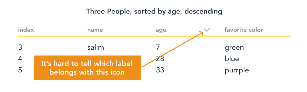
Labels SHOULD be visually adjacent to their controls.
For example, when we have a table that has sorting, the icon must be close to the column’s label; if not, it is hard to know which label belongs to the icon.
Let’s see a bad example:
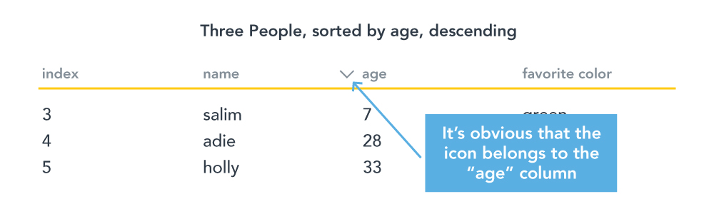
How it can be fixed:
The layout SHOULD have only one main visual focus.
To not compete with the user’s attention, the page’s design should have just one main visual focus, preventing the user from getting distracted.
The design SHOULD draw attention to the intended visual focus.
Color and contrast can draw the user’s attention to the visual focus. For example, when a dark overlay appears when activating a dialog or modal, visual attention is drawn to the high-contrast element rather than the darkened, low-contrast element.
Target Size
The touch target size of actionable elements SHOULD be at least 44 pixels by 44 pixels with at least 6 pixels of inactive space between any adjacent actionable elements.
Small targets can be difficult to click or touch. WCAG 2.1 recommends a minimum target size of 44 x 44 pixels to ensure that users can activate them, but experts recommend a target size of 48 x 48 pixels.
Reading and Focus Order
The reading order MUST be logical and intuitive.
The order of the elements in the DOM matters. Screen readers will ignore all the CSS in your web design. Best practice is to disable the CSS and check if the reading order of the elements makes sense and is easy to understand.
The navigation order of focusable elements MUST be logical and intuitive.
When keyboard users navigate through the page with a tab, they expect to navigate from the top to the bottom linearly, such as when reading a book, from the top left side to the right bottom. Like a screen reader, the browser will ignore all the styles, such as positioning or floating, so the element’s position in the DOM matters.
tabindex of positive values SHOULD NOT be used.
Even when modifying it and adding an item to the top of the reading order is possible, the recommendation is not to do it. It will confuse keyboard users:
- It causes a discrepancy between the tab order and the reading order
- It removes the items from their natural tab order
Typography matters
Users with cognitive, language and learning disabilities or some low vision cannot perceive the text or lose their reading place if it is presented in a problematic manner. It’s important to clarify that rules related to typography in WCAG 2.1 are recommendations for Level A and Level AA compliance but are requirements for Level AAA.
Fonts SHOULD be easily readable by sighted users.
Some research has been done in this area, and the recommendation is to avoid fancy fonts, especially cursive or unusual forms. For example, Standard serif and sans-serif fonts are both considered acceptable.
Line spacing SHOULD be at least 1.5 within paragraphs.
People with cognitive or reading disabilities find it difficult to track text where the lines are close together. The recommendation is to have a space between lines from 1.5 but should not exceed 2.0.
The number of characters or glyphs per line in any section or column of text SHOULD NOT exceed 80 (40 characters in Chinese, Japanese, or Korean).
For users with reading or vision disabilities, long lines are hard to read.
Text SHOULD NOT be fully justified.
When we justify text, words can be either closely or stretched in unnatural ways, making it difficult for users with certain kinds of reading or cognitive disabilities to locate word boundaries.
Fonts SHOULD be user-customizable.
To be able to customize fonts, text should be in regular HTML format, not in images.
Who needs to customize fonts?
- Users with low vision often need large, high-contrast text.
- Users with reading disabilities who may need increased line spacing, paragraph spacing, or even custom fonts, such as fonts designed to be more easily readable for people with dyslexia, such as https://www.dyslexiefont.com/ or https://opendyslexic.org/
About CSS-generated and Visually Hidden Content
CSS-generated content SHOULD be avoided.
If the content is meaningful and not just decoration, it should be avoided since not all screen readers can support it.
A text alternative for informative CSS-generated content MUST be provided, AND the CSS-generated text SHOULD be set to aria-hidden=”true”.
Even when CSS-generated content should be avoided, in cases where we can not, we need to provide alternative text, considering the screen reader limitations. At the same time, the CSS-generated content should be hidden from screen readers.
Decorative or redundant CSS-generated content SHOULD be set to aria-hidden=”true”.
If the generated content is just decorative, there is no reason to have it available to screen readers.
Visually hidden and inactive content MUST be hidden from screen reader users until it is made visible and active for sighted users.
The idea is to give screen reader users the same experience as sighted users. So, any element that is intentionally visually hidden but exists in the DOM, such as inactive dialogs, collapsed menus, etc., must also be hidden from screen reader users.
When additional content is triggered on pointer hover or on keyboard focus, that additional content MUST be dismissible, hoverable, and persistent.
This rule ensures that pop-up content like custom tooltips or submenus in a navigation bar does not prevent user access to other page content and that users have adequate access to that content. They need to be able to dismiss the new content without moving the mouse or keyboard focus, for example, by pressing the Escape key.
Users who magnify their screen also need to be able to hover their mouse pointer over the new content without losing it.
Content should not disappear until the keyboard or mouse hover leaves it. Users need adequate time to read and understand the content.
Exceptions to this rule:
- Modal dialogs, tooltips, or content that is controlled by the browser.
- “Skip to main content” links that become visible when they receive focus.
Additional resources:
- https://www.w3.org/TR/WCAG21/
- https://www.w3.org/WAI/WCAG21/Understanding/use-of-color.html
- https://webaim.org/articles/contrast/
- https://dequeuniversity.com/checklists/web/reading-focus-order
- https://m2.material.io/design/usability/accessibility.html#understanding-accessibility
- https://venngage.com/blog/accessible-fonts/
- https://www.siteimprove.com/glossary/accessible-fonts
- https://www.esdesignbarcelona.com/actualidad/diseno-web/la-importancia-de-los-espacios-blancos-en-diseno-web-como-utilizarlos